Support the Art(ist)s...
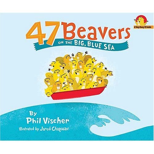 My good friend Jared Chapman illustrated this book by Phil Vischer who also happened to come up with some cartoon or another about some chatty bouncing vegetables? Anywho... this is definitely on my to buy list as Jared is a phenomenal arteest
Labels: Books